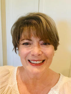
By Emily Groff
Have you ever wondered what it feels like to become a debut author? D.L. Broom has always been a voracious reader and has awaited her chance to write. She held many different careers through the years, the primary one being an early elementary educator, but she is most excited for her new career as an author who touches the hearts of all who read her words.
Broom reads thrillers, light, and sci-fi, and enjoys writing historical fiction and horror. You may be wondering how she came about publishing a young adult novel, a genre out of her usual comfort zone. Look no further. I had the pleasure of interviewing Donna Broom and learning more about her debut novel, Sunflower.
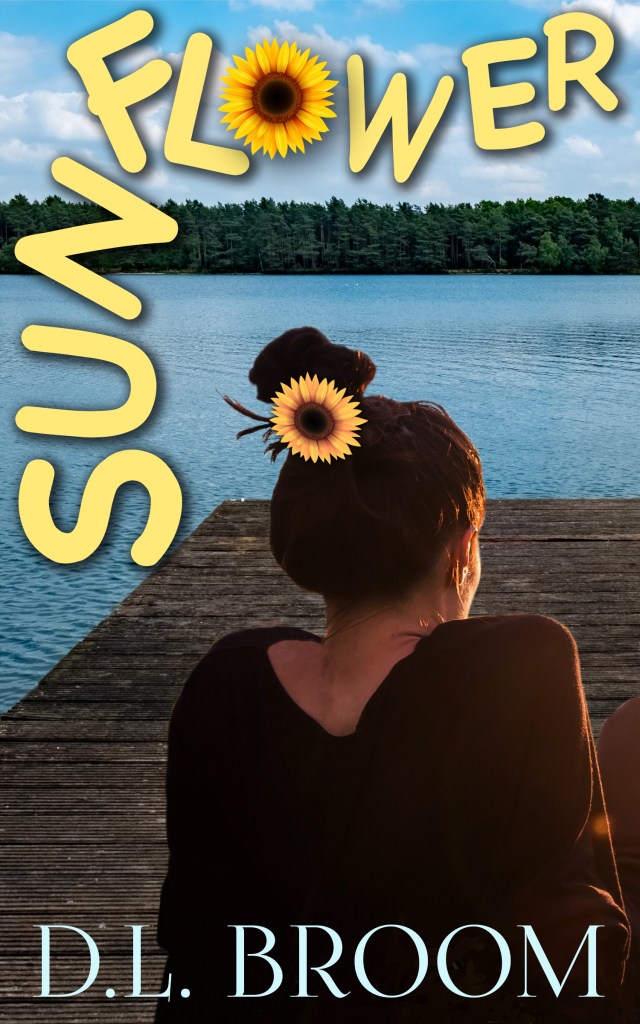
Tell us about Sunflower, your Wild Ink Publishing debut novel. What is this book about, and how did you come up with this story? Why should readers read this book?
Like most people in my age group (Gen X), I read all the Nancy Drew and Hardy Boys mysteries. I love the cozy mystery format even though I also enjoy authors like Jo Nesbo, Preston & Child, and Freida McFadden who write much more intense stories. I’m also sensitive to my writing being authentic. Teens have access to incredibly written, hard-hitting, topical novels that aren’t my life experience. I wanted to give the YA audience a fun, cozy mystery with a bit of sweet romance that harkens back to the Nancy Drew series. This YA mystery explores what happens when a girl’s boring summer job turns into a dangerous search for answers to a tragic family secret. I’m excited to offer Sunflower to the world!
You are a debut author with Wild Ink Publishing. What was this experience like?
Working with Abby and her team at Wild Ink has been wonderful! I spent almost two years in the querying trenches, completing my MFA at SNHU in 2022, and she took a chance on me and Sunflower. I love working with fellow SNHU grads (and instructors) and the journey has been so exciting and rewarding. I can’t believe my novel is actually out!
When did you first know you wanted to start writing? What got you interested?
I’ve wanted to write since I was a child, but I didn’t have the confidence to go the distance. I wrote occasional stories through the years, but I always ripped them up and disposed of them. I will say that children these days have so much more support for their writing. Teachers have the training and resources to give children writing opportunities, and authors come in to give advice through workshops and assemblies-it’s amazing!
How did you begin writing Sunflower, and what sparked the idea?
My Sunflower project started after a compilation of opportunities. I was working at an Atlanta private school when the children’s author, Jack Gantos, came by and not only did an incredible assembly for the students, but also did a teacher workshop that I was lucky to attend. He outlined his process for writing children’s books and made it feel so attainable. I highly recommend his book, Writing Radar. The second opportunity came when my husband and I traveled to Boyne City, Michigan, to visit with great friends. I had never been to the state of Michigan, let alone any of the Great Lakes. I was blown away by the beauty of the region. When we visited the sweet town of Walloon Lake, I was just charmed, and my idea of a teen girl coming to the town, meeting a cute boy, and solving a mystery just popped into my head.
You read thrillers, light sci-fi, and enjoy writing historical fiction and horror. How did you tie in these interests to Sunflower, or is Sunflower a whole new genre for you?
A totally new genre for me. I’d never read what was considered Young Adult when I was growing up; I’d jumped right to adult novels because that’s what was on the bookshelves at home. It never occurred to me that I’d write a YA novel until I thought of Ivey’s story. I was in the middle of my MFA and working on a historical novel as my thesis project when I decided to switch to YA. SNHU has so many experienced instructors in the YA world, I felt Sunflower had a better chance of publication than my historical fiction project at the time. I’m still working on the historical novel, which centers on my Irish ancestor who was hanged for treason in 1798. I’m also working on the second book in the Sunflower series and a futuristic sci-fi.
What is your writing process like? Do you have any particular tips, methods, or writing strategies that help you?
Gosh, I feel like I’ve tried everything from outlining extensively to writing streams of consciousness. When writing Sunflower, I decided to have short chapters, so I made an outline using the chapter numbers and wrote a sentence or two about the chapter content. When I got stuck midway through the manuscript, I received great advice to go ahead and write the ending. That was a game changer! It made my writing easier when I knew where I wanted Ivey’s story to go. Being a committed reader is vital. Not only does it keep me current on genre trends, but it also shows me what types of characters and plots are in demand. Bottom line- what I love to read or write may not be what the masses want, but I need to know, so I can be successful in publishing.
Tell me a fun fact about yourself!
Most people find it interesting that I lived in Hawaii when I was a little girl. My Dad was in the Air Force, so we moved to Oahu when I was seven, and we lived there until I was ten. It was a unique experience because Hawaii is culturally very different from the “mainland”. It was a beautiful place to run around as a child, and it inspired my original fairy tale titled “Pele’s Hair”.
Oh! I also attended summer school at Punahou, from which President Obama graduated.
To learn more about Donna (D.L.) Broom, visit her website: https://dlbroomwrites.com/